One Store, Two Front Doors
Restructuring a 200+ category wall decor store so homeowners and trade buyers each find their own way to the right piece, made to their size.
Role
UX Research
IA
Wireframes
Timeline
3 months
January – March 2026
Team
1 Growth Manager
1 Owner
Problem
200+ categories, one way in
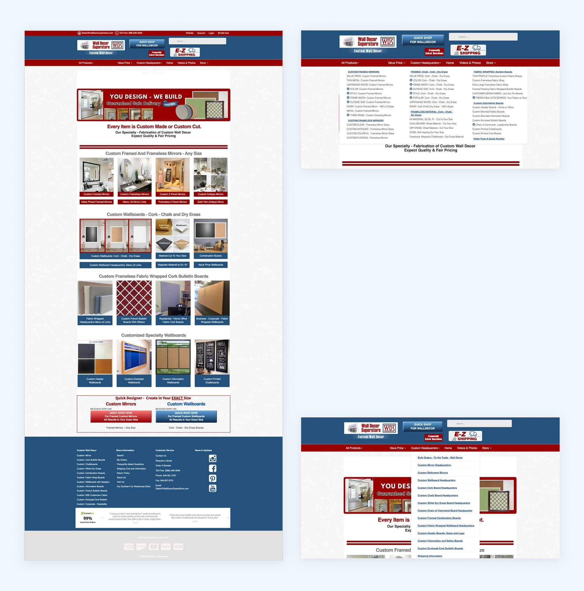
Wall Decor Superstore sells to two very different buyers: homeowners decorating their own space, and designers and contractors sourcing for clients. Both shopped through the same site, and four problems got in their way:
Too many categories
Almost everything is made to order, and every customization option became its own page: custom mirrors by color, by style, by frame width, by outside size, repeated for every product type. That is how the store reached 200+.
No guided way to customize
Shoppers had no clear way to choose a size, frame or finish.
No real path for trade buyers
Only a small link in the top bar and an application block at the bottom of the page.
Low trust at checkout
Payment options weren't clear and there were few signs the store was secure, so many shoppers didn't feel safe paying online.
The result: 64% of shoppers abandoned the cart, and 76.9% of visitors bounced.
Constraint
No rebrand, so structure had to do the work
The owner has run the store since 2001, and his customers know it by its look and feel, so the fix had to come from structure, not a new visual identity.
Research
Eight segments, two to lead
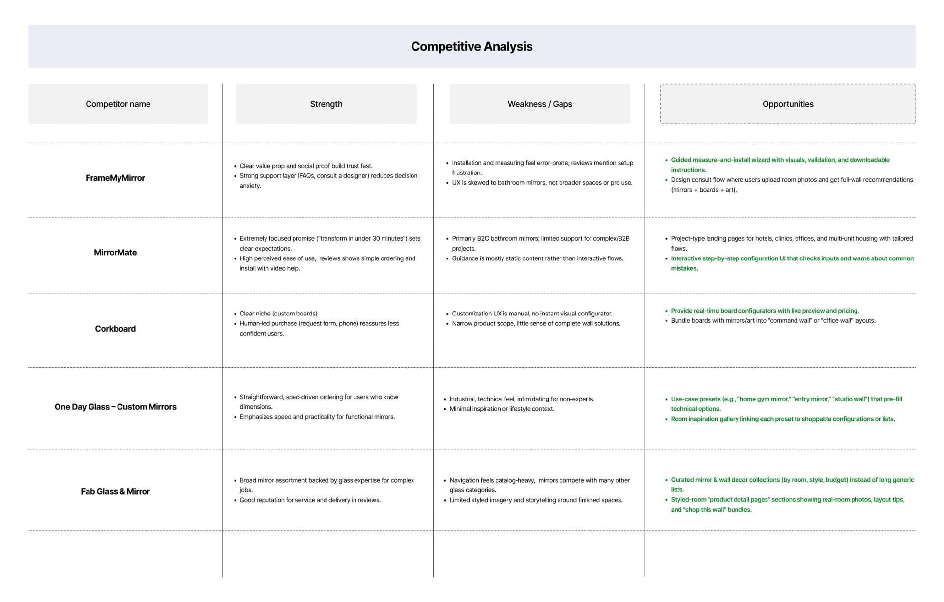
I started by breaking the brief into plain questions: who "home decorators" really are, what "struggling to find" means in practice, and what makes a shopper feel safe enough to pay. Then I scored eight customer segments on purchase frequency, revenue potential, and cost to win, using the client's analytics, market data, and a review of five competitors.
| Segment | Frequency | Why / why not | Priority |
|---|---|---|---|
| Interior Designers | 4–6× a year | Lead segment. Highest revenue, recurring projects, lowest cost to acquire relative to lifetime value | ★★★★★ |
| Homeowners | 2–3× a year | Lead segment. Largest market (83M households), proven spending, renovations trigger purchases | ★★★★★ |
| DIY / Style Enthusiasts | 4–6× a year | Social-media driven, trend-responsive | ★★★★ |
| New Movers / Students | Triggered by a move | Large cohort (48M movers a year), buys several pieces at once | ★★★★ |
| Contractors | 3–4× a year | Volume buyers in a growing renovation market; need reliable bulk supply | ★★★★ |
| Staging Companies | Monthly | Out of scope. Predictable revenue, but a rental model is a different business | ★★★★ |
| Renters | 1–2× a year | Underserved and growing; removable decor fits them well | ★★★ |
| Hospitality / Small Business | Per project | Large market, but high cost to acquire; needs consultation and customization | ★★★ |
What the research pointed to: two audiences can share a store, as long as they don't share a path.
The Solution
Structure first, UI later
Two journeys, one store
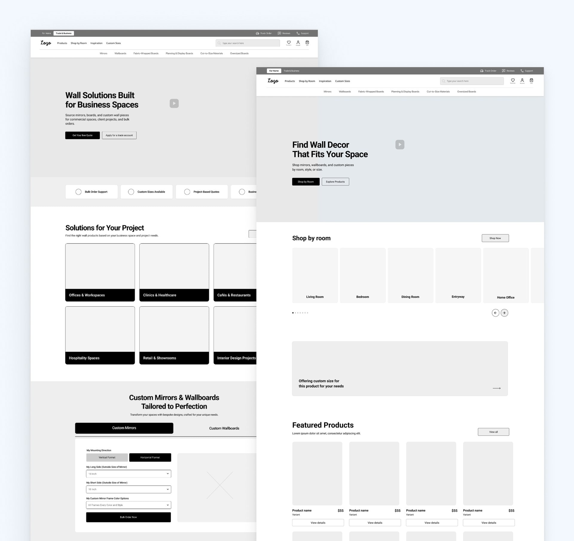
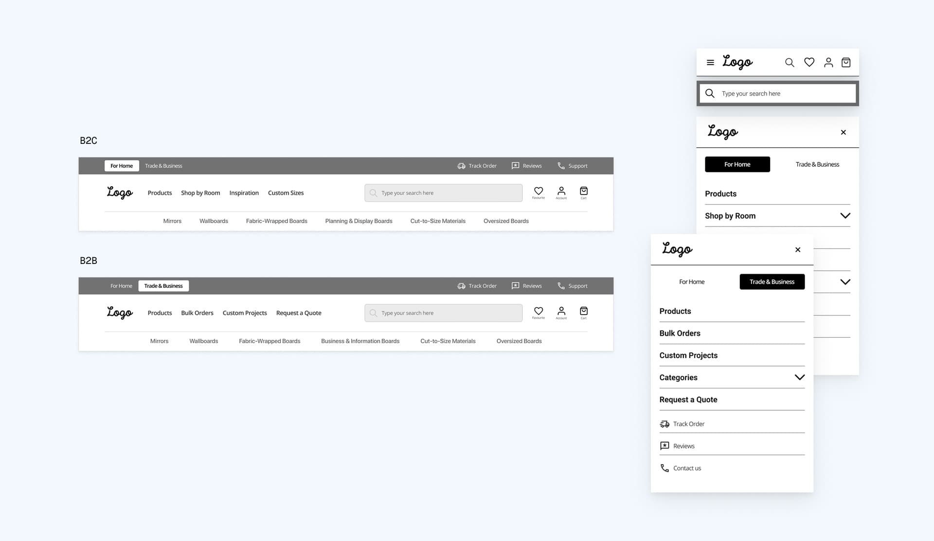
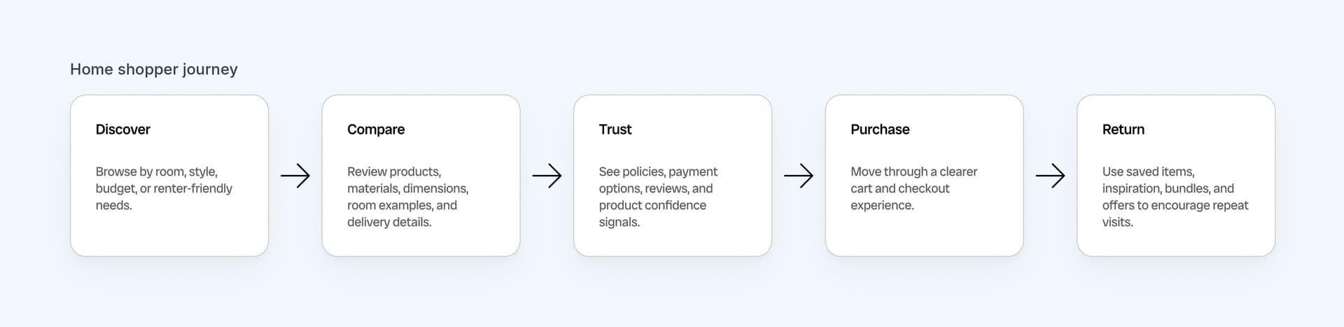
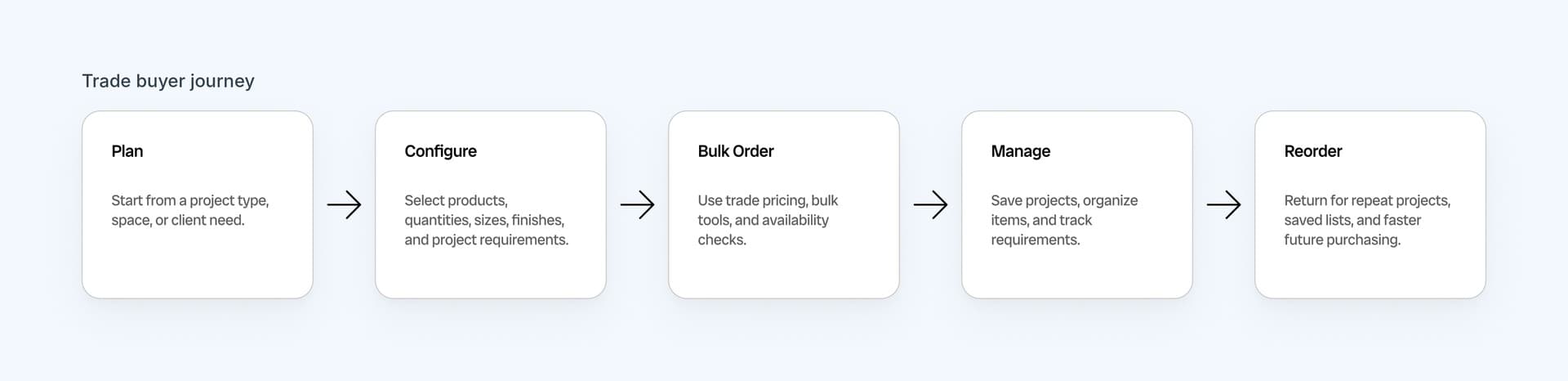
The call: two different journeys on one catalog, one for home shoppers (B2C) and one for trade buyers (B2B). That's why the header carries a For Home / Trade & Business switch. Each mode shows its own paths over the same catalog, with no second store to build and maintain.
What it cost: one catalog has to work for two audiences, so every page serves both buyers and the header carries a mode switch.
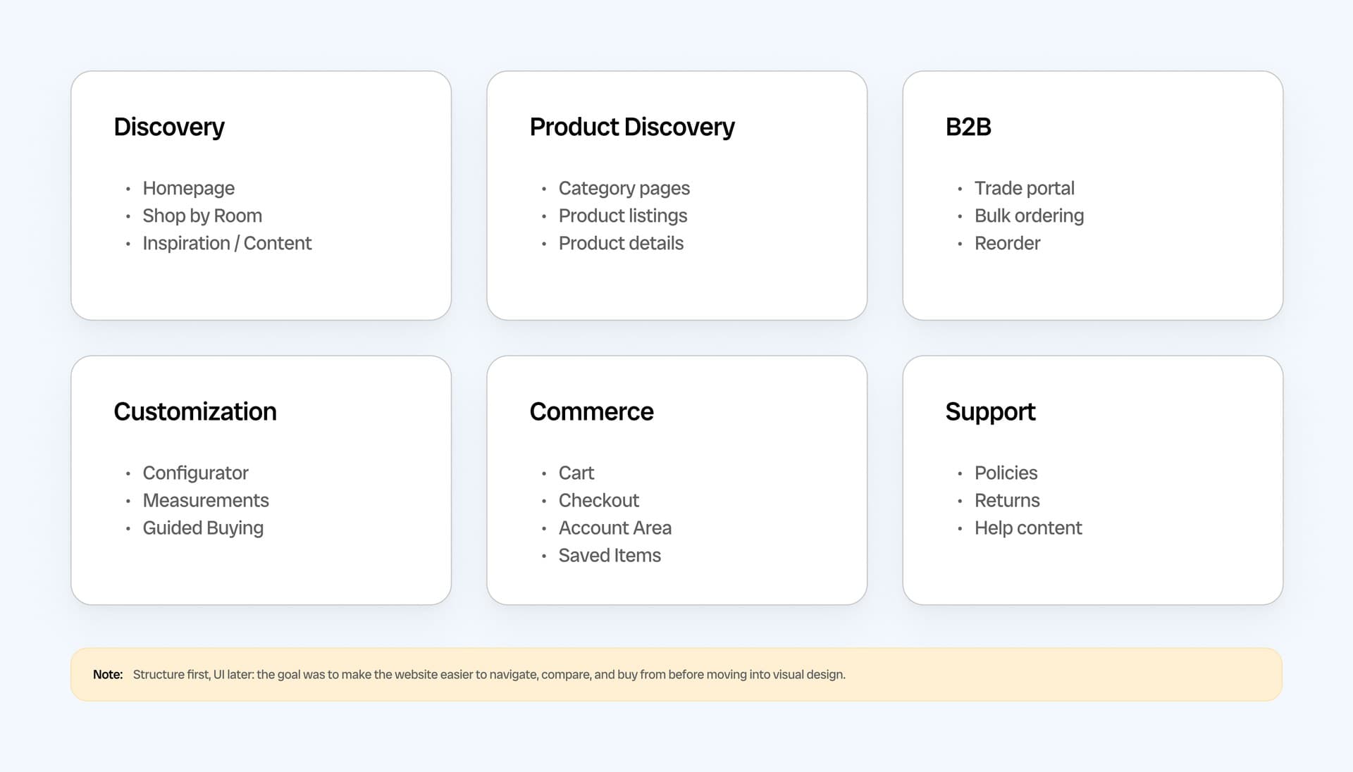
Before any visual design, I built the information architecture: 45 pages grouped into six areas (Discovery, Product Discovery, B2B, Customization, Commerce, and Support). It had two jobs: give each buyer, home shoppers and trade buyers led by interior designers, a separate journey on top of the same catalog, and turn customization into a guided 7-step flow. Relume gave me a fast first structure to check against; the architecture itself came from the research.
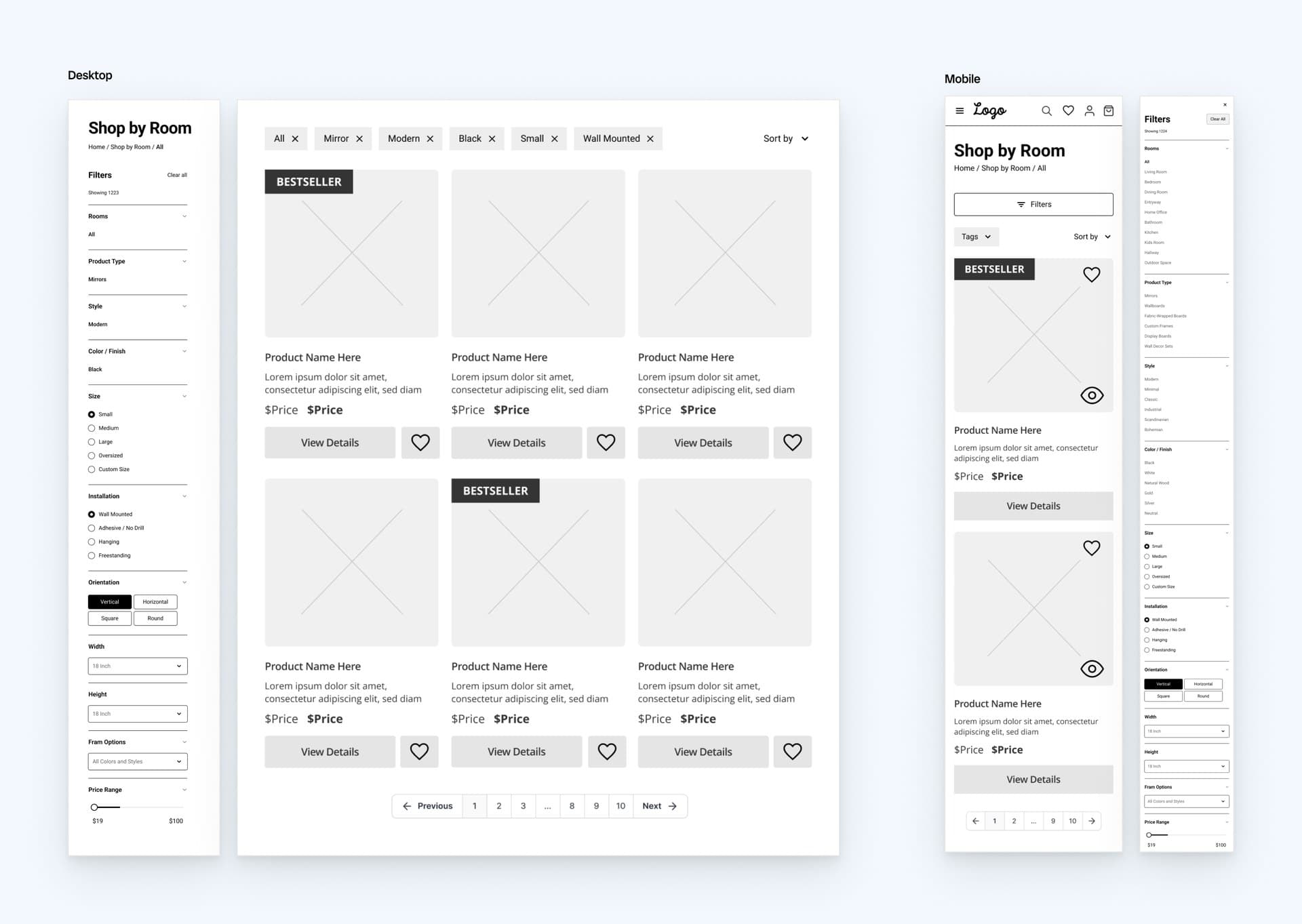
That structure then shaped the key wireframes:
- Room scenes that link straight to the pieces in them.
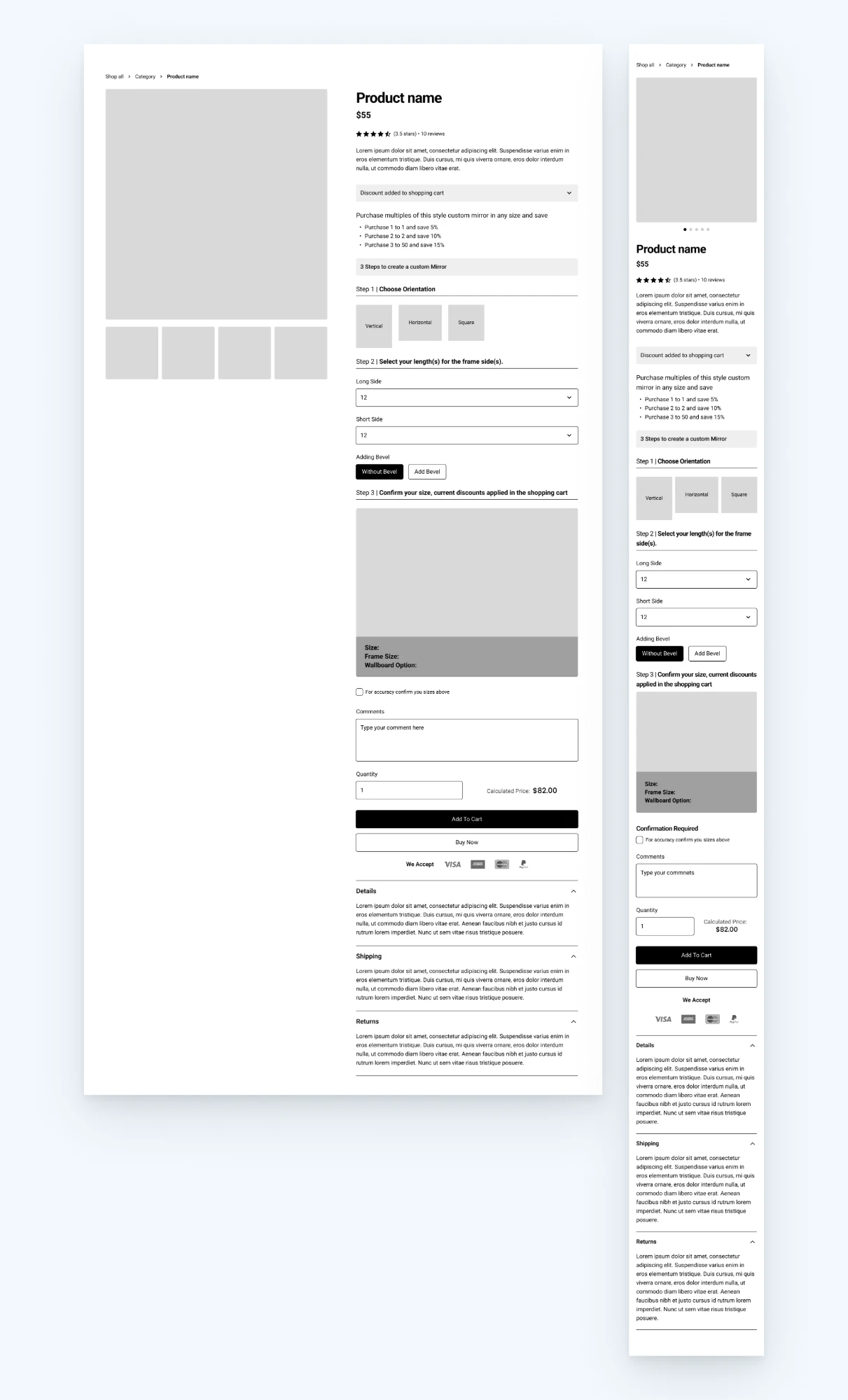
- Product pages that answer size, materials, delivery, and returns up front.
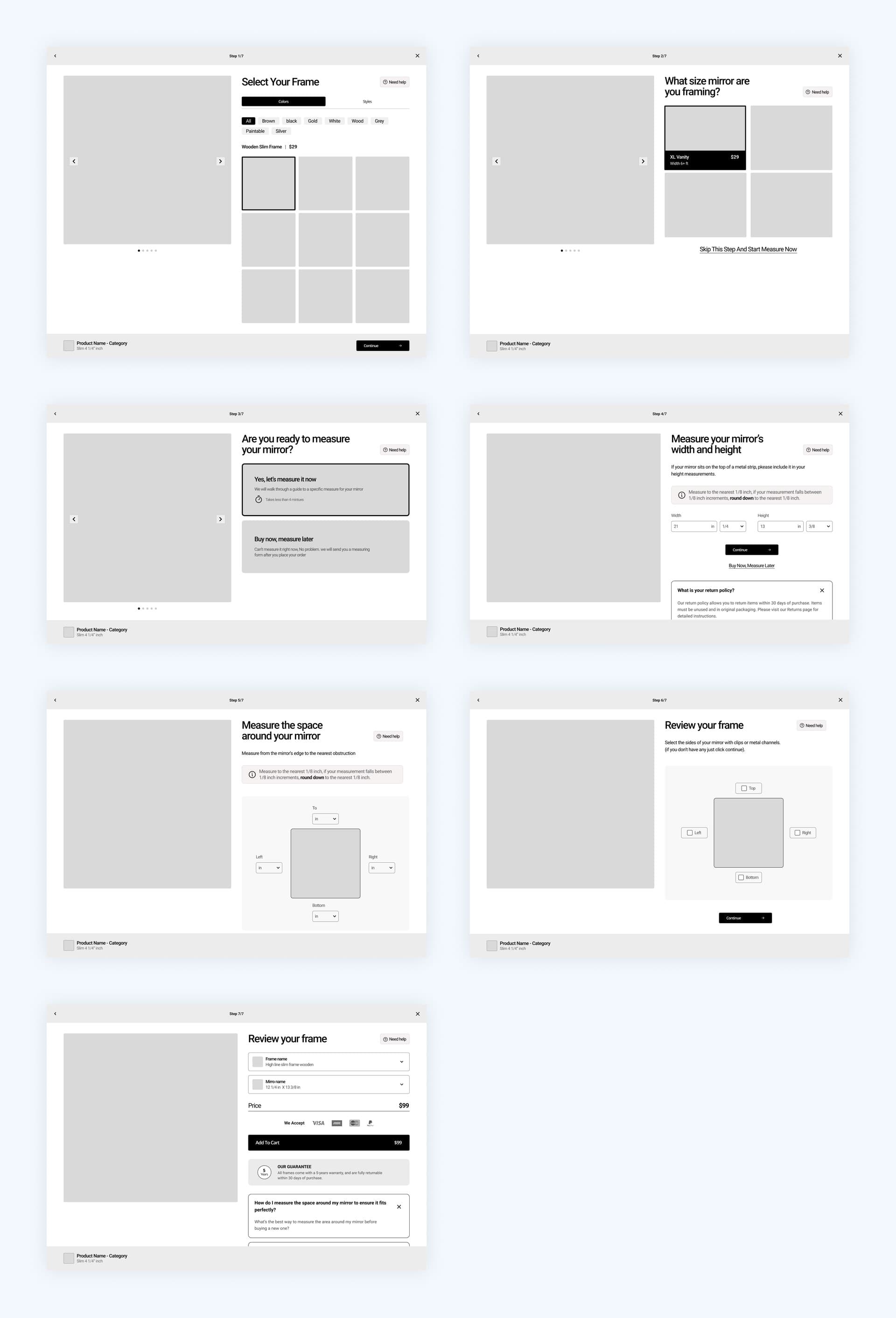
- A 7-step configurator that replaces dozens of custom category pages with one guided flow.
- Payment and trust signals a "We accept" row with payment logos and a trusted-website label, in the footer and right below the Add to cart button.
Categories first?
The call: rooms first for home shoppers, with categories kept underneath. People think "my hallway" before they think "oversized board."
What it cost: shoppers who already know the product type take one more step to reach the category menu.
Make shoppers measure first?
The call: no. In the configurator, shoppers can measure now with a guided walkthrough that takes under four minutes, or buy now and get a measuring form after they order. Not having a tape measure at hand shouldn't stop a custom order.
What it cost: some orders reach the team without final measurements, so a measuring form follows after checkout.
A cart for every order?
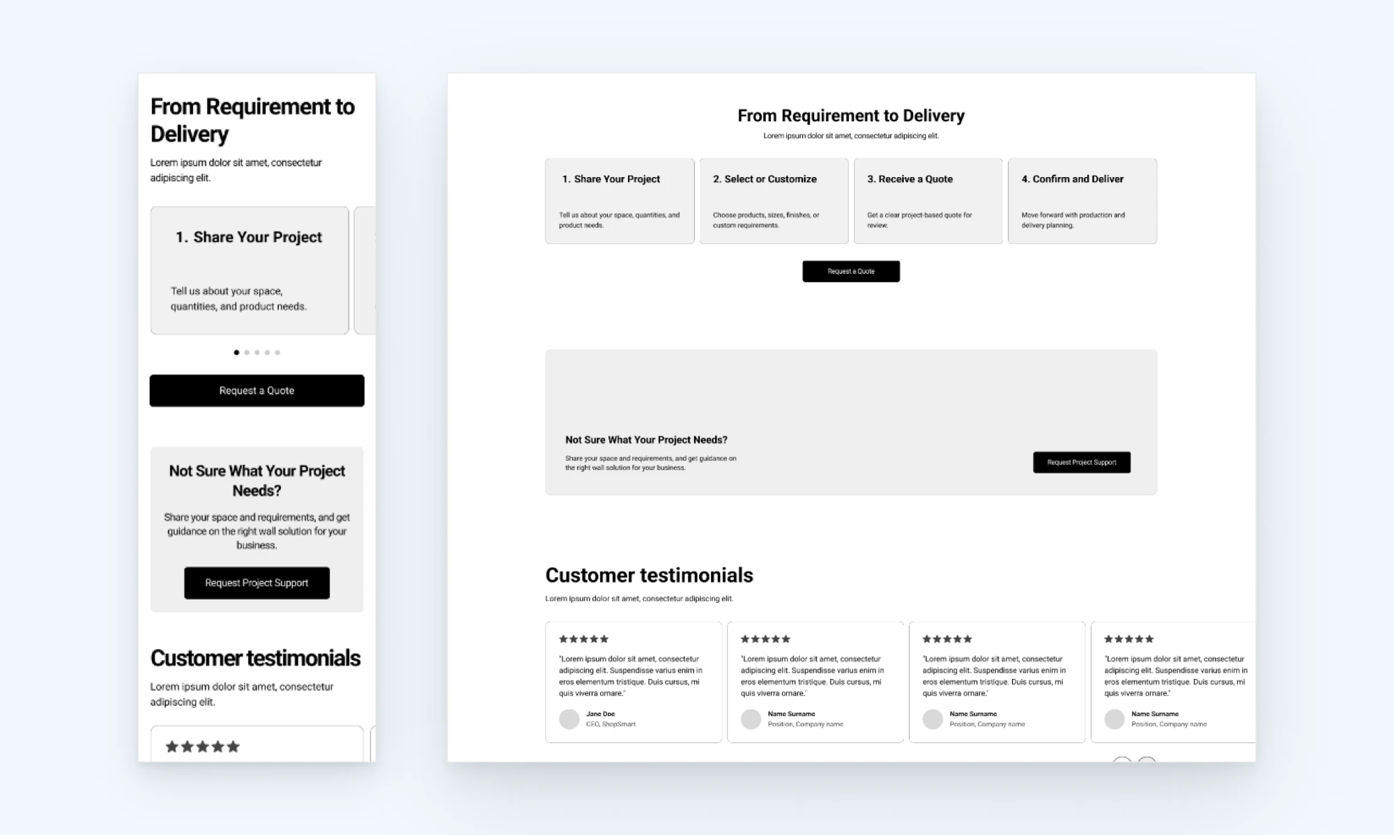
The call: large, custom, or multi-space trade orders go to a quote, not a checkout. Buyers keep moving, and sales gets a qualified lead.
What it cost: large trade orders need a human reply, so buyers wait for a quote instead of checking out, and sales has to answer each one.
Outcome
Delivered, now in the client's hands
I delivered the full 45-page wireframe package with UX recommendations. The client's team is now designing the final UI with their own design system and building the site in-house. Because the structure was settled first, they can focus on execution instead of rethinking how the store should work.
Already in use: I recommended a "We accept" row with payment logos and a trusted-website label in the footer and right below the Add to cart button on the product page. The client has added it to the live site.
How success will be measured after launch: cart abandonment below today's 64%, trade quote requests and account sign-ups from a starting point of zero, the share of custom orders started in the configurator that get completed, and the share of home shoppers who start from Shop by Room.
What this project taught me: a large store needs clearer paths more than it needs more pages.
Want the full story?
The detailed version: segments, competitive scan, page templates and every wireframe group.