From Multi-Step Form to Conversation
Turning a qualification form into an AI assistant that helps business owners find the right service in their own words.
Role
Product Strategy
UX/UI Design
Research
AI Experience Direction
Timeline
2 months
July – August 2026
Team
1 PM
2 Devs
Problem
A good form asking the wrong question
By every UX standard, the form was good: clear steps, structure, a review screen. A third of users still quit at step 3, where they had to choose their type of support: a one-time service, a monthly package, or ongoing support.
Tshilat offers 150+ financial, administrative, and legal services to SMEs in Saudi Arabia. Owners don't think in service categories; they think in situations like "my books are a mess." Of 131 target visitors who saw the form, only 6 requested a consultation.
The Process
How a form became a conversation
The form wasn't bad. It was clear and structured. The problem was that it asked users to translate their own situation into our labels. That shift, from fixing friction to understanding intent, shaped every step that followed.
1. The form: solved friction, not the real problem
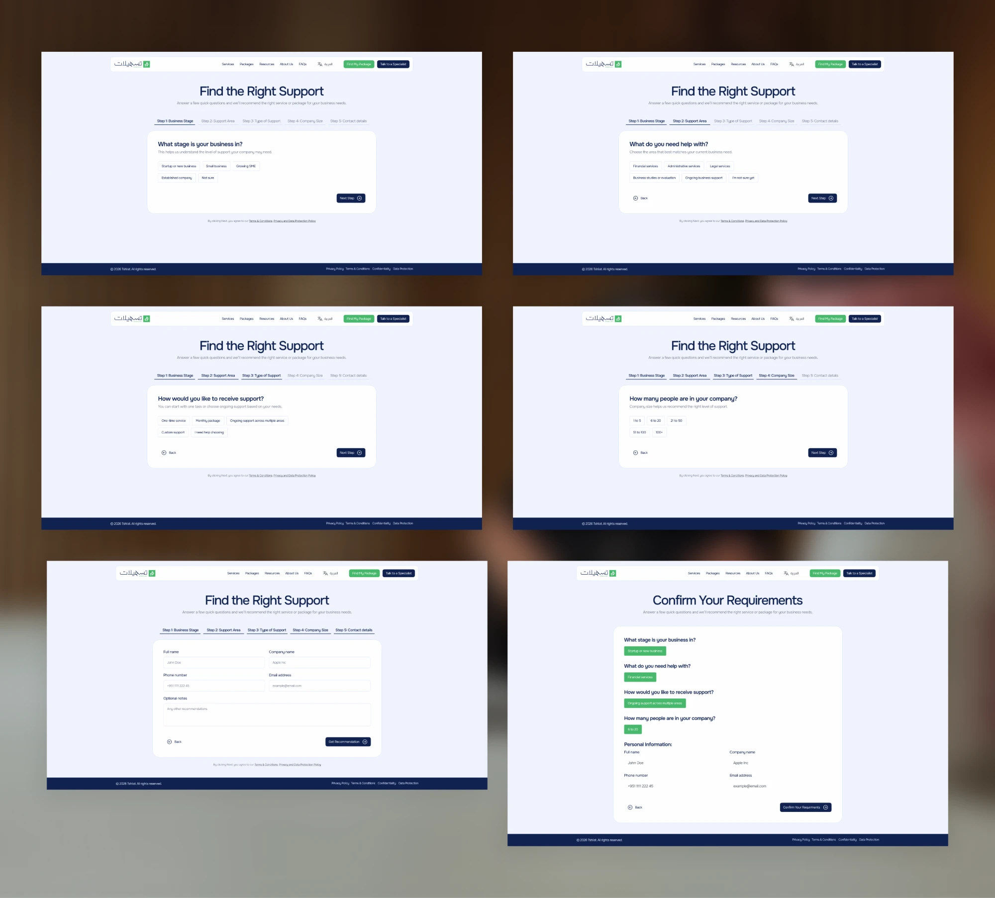
My first design was a five-step guided form with a review screen. It gave qualification a clear structure, but users still had to pick the right option themselves, and most of the drop-off landed on the one step that asked them to.
2. The skeptical owner: a prototype, not a pitch
I proposed an assistant that interprets business situations instead. The owner said no, worried it would recommend the wrong service and that his customers weren't ready for AI. So the developers and I built a working prototype and demoed it, then agreed to let an A/B test decide. Both of his concerns became design rules.
3. First attempt: recommended too early
What didn't work: it suggested services after only a few questions. One tester said it felt like being sold to before being understood.
What changed: the assistant now summarizes what it heard and confirms it before recommending anything.
4. Second attempt: opened with a blank text box
What didn't work: users didn't know how much to write. Some typed a few words, others gave up.
What changed: guided prompts first to build momentum, free text saved for clarification later.
5. Deciding what the AI must never do
I mapped every task in the journey and decided how much the assistant should take on. Finding the right service: fully automated. Legal or financial advice: never, always a human. Drawing that line is what made the rest safe to automate.
| Task | What the assistant does | Where a human approves |
|---|---|---|
| Find the right service | Asks guided questions and detects intent from the answers | Fully automated |
| Share business details | Asks only what's relevant and keeps a live summary | User can edit |
| Choose services | Recommends best-fit services and explains why they match | User confirms |
| Brief the sales team | Writes the qualified lead summary for the handoff | Sales reviews |
| Legal or financial advice | Nothing. Hands the user to a human specialist | Human only |
The Solution
An assistant that listens first
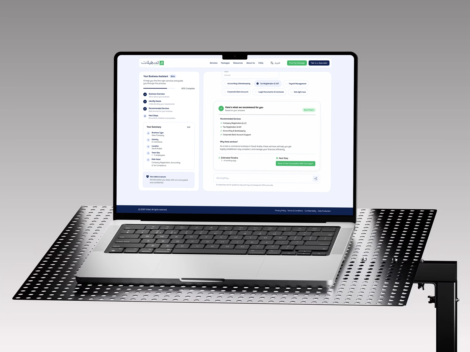
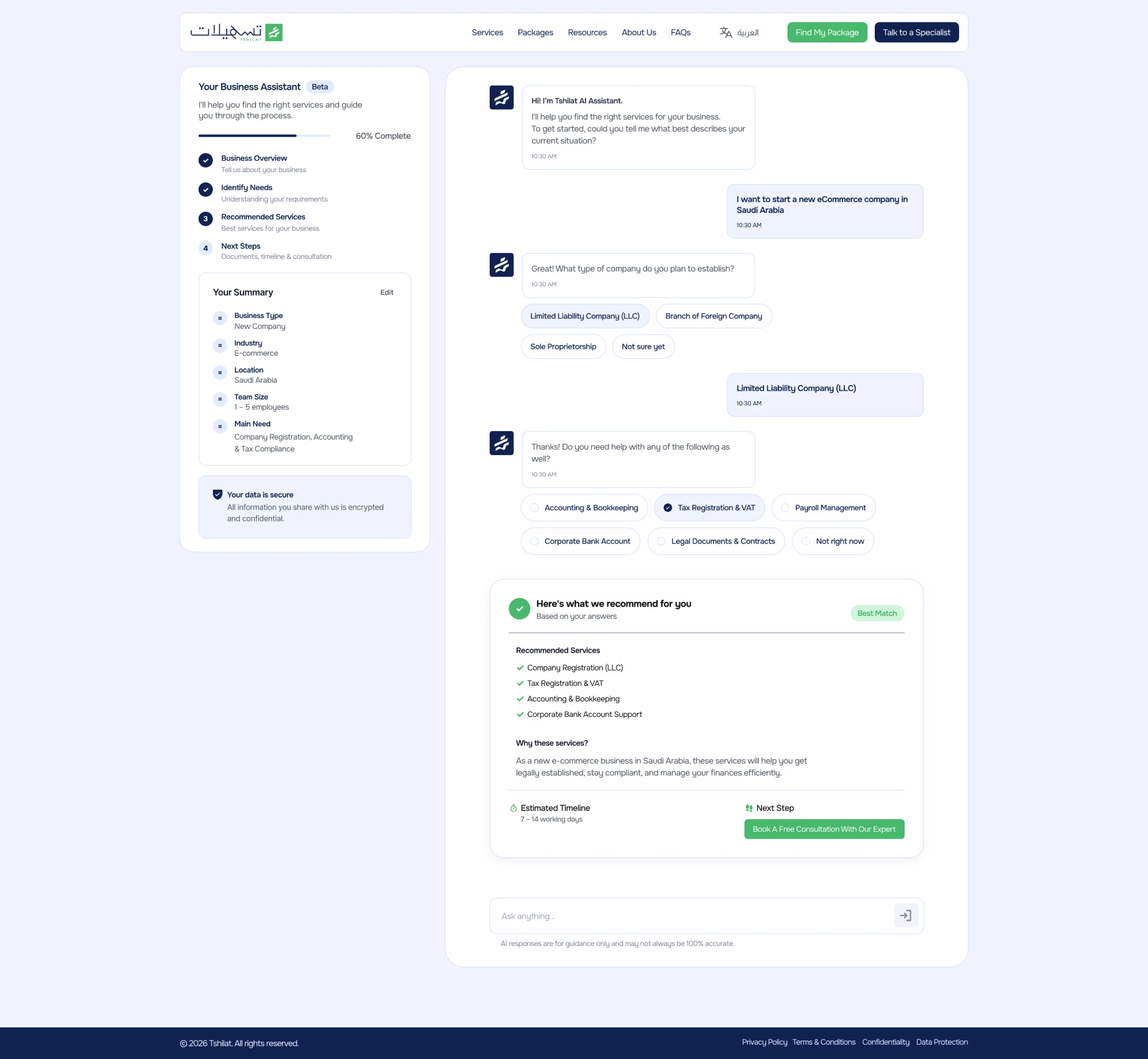
Users describe their situation, the assistant works out what they need, recommends services with the reasoning behind them, and hands off to a person at the right moment.
Trust you can see on screen. A "why these services" explanation, an Edit link on every answer, nothing submitted until the user confirms, and a specialist one step away.
Designed for the second user too. Every conversation ends with a qualified lead summary for sales, so they start the call already knowing the situation.
The Test
Form vs. assistant
We ran both versions with real target visitors, about 140 per variant, through the same landing page. The assistant lifted completed onboarding by 83% and consultation requests by 67%.
| Metric | Form | AI assistant | Change |
|---|---|---|---|
| Target visitors | 131 | 148 | Similar traffic |
| CTA interactions | 31 | 43 | +39% |
| Started qualification | 18 | 30 | +67% |
| Completed onboarding | 12 | 22 | +83% |
| Consultation requests | 6 | 10 | +67% |
| Leads ready for sales, no clarification call needed | 58% | 86% | +28 pts |
It was a deliberately small first batch, so the results are a strong signal rather than statistical proof. But every metric moved the same way, from first click to sales-ready lead, and that gave the owner the evidence he asked for.
Outcome
Proven, and ready to launch
The A/B test gave the owner the evidence he asked for. The assistant is built and ready for live visitors, and its public launch is sequenced behind Tshilat's own ERP rollout.
Once it's live, I'd watch consultation requests and sales-ready leads first, since those two show whether the assistant is doing the translating for users and for the sales team.
The lesson: design for intent, not just friction. The assistant didn't remove steps; it did the translating users couldn't.
Want the full story?
The detailed version: agentic opportunities, conversation principles, the full validation table and reflection.