A UX and CRO Audit for a Six-Figure DTC Supplement Brand Converting at 1.2%
Turned one conversion number into 16 findings, two testable page variants and a redesigned landing page.
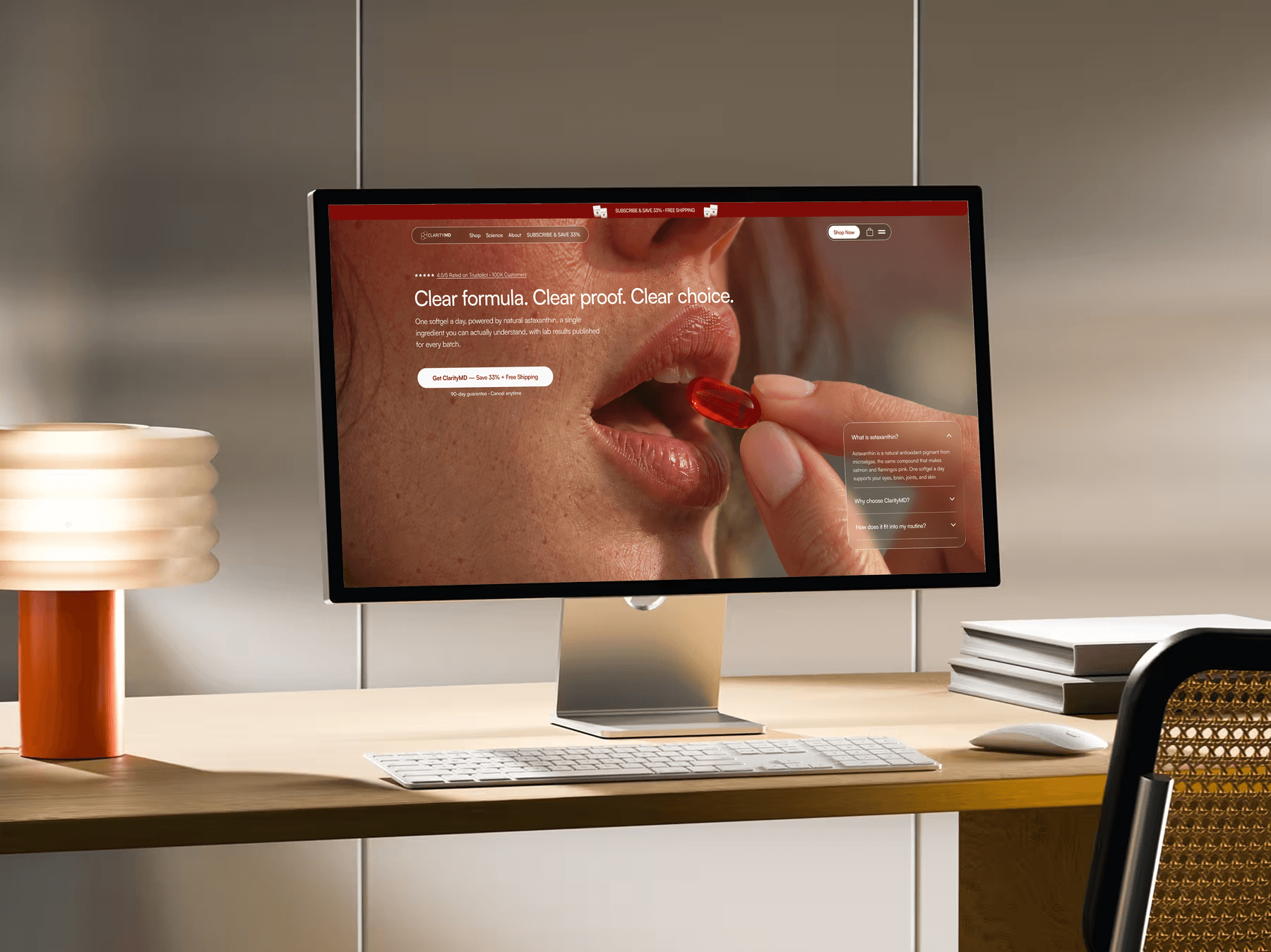
Role
UX Audit
CRO Strategy
Competitive Analysis
UI Design
Timeline
September 2026
Approved, now in A/B testing
Team
ClarityMD CEO
Marketing Manager
CRO Lead
Problem
The right formula, and no reason to buy it here
A shopper lands on ClarityMD's product page. The formula looks right: 12mg, one ingredient, lab reports. But so does every competitor's. They can't tell why they need it, why to trust this brand, or which of five prices to pick. So they close the tab.
ClarityMD is a six-figure DTC brand built on one product, so every sale runs through this one page. In my first meeting with the CEO, the brief had two parts: the store converts at 1.2%, and he wanted a new landing page that looks premium. I was brought in to find out why the store wasn't converting, and to design that page.
Insight
The store had plenty of reasons to buy
But it never said which one mattered.
I walked the homepage, product page, cart and navigation as a first-time shopper and logged 16 frictions. Benefits, science, dosage, testing, guarantees and discounts all had equal weight. The shopper was left to answer four questions alone, in order:
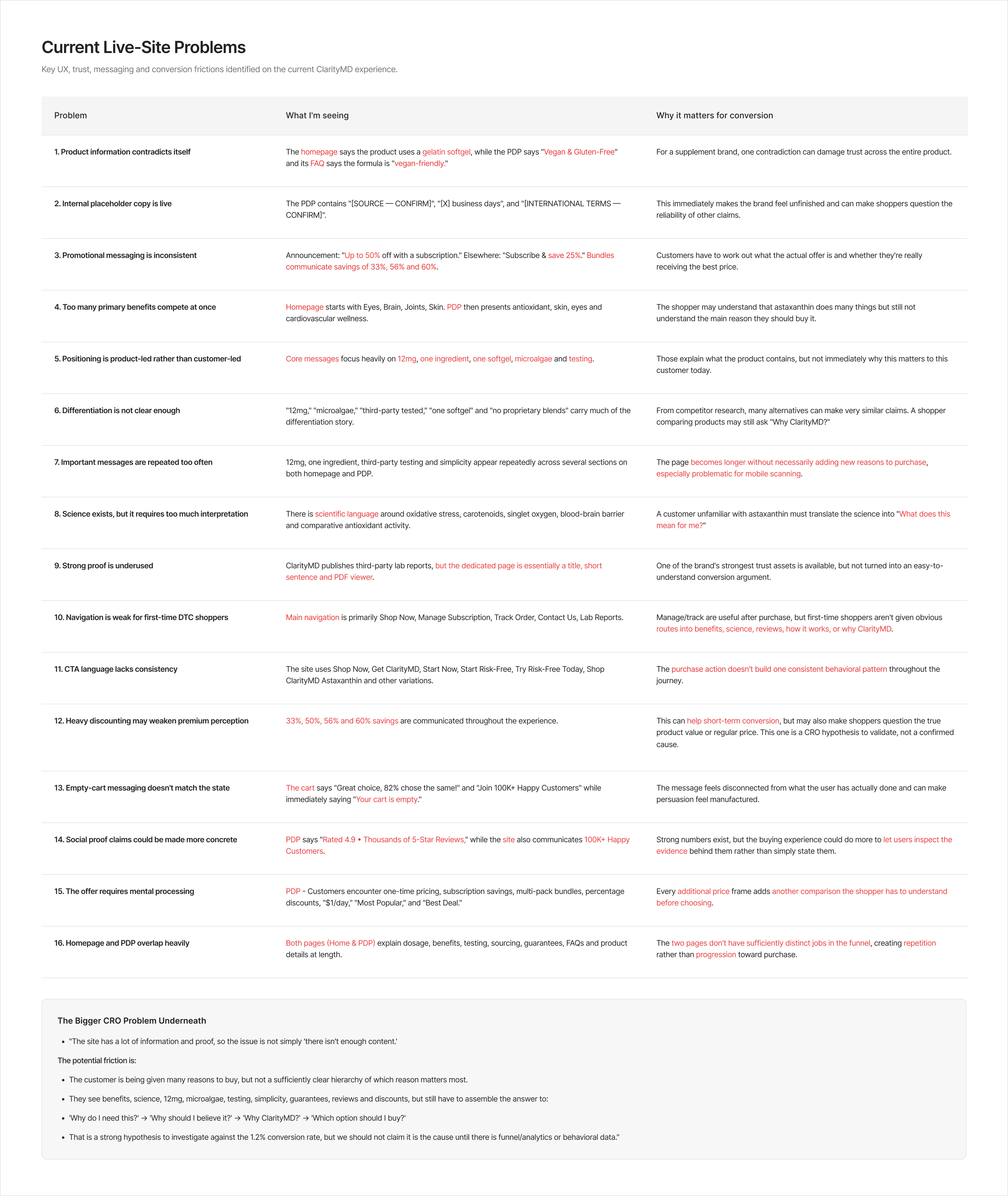
The Audit
Three patterns behind the 1.2%
The hard part: one page for six kinds of shopper in a crowded category. The audit found three patterns holding the page back.
Leads with the ingredient
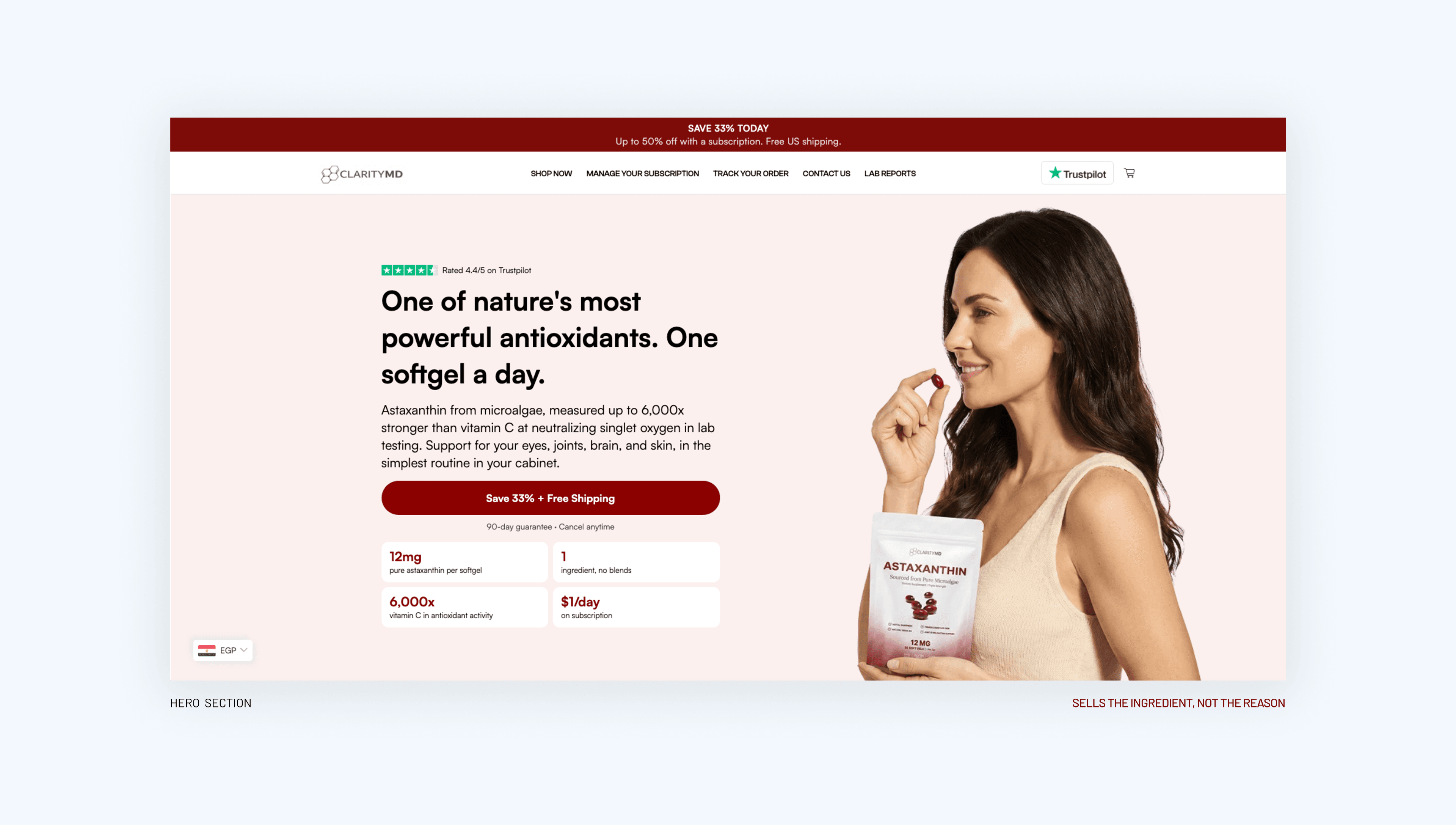
Every competitor claims 12mg and microalgae, so nothing sets ClarityMD apart.
Every benefit at equal weight
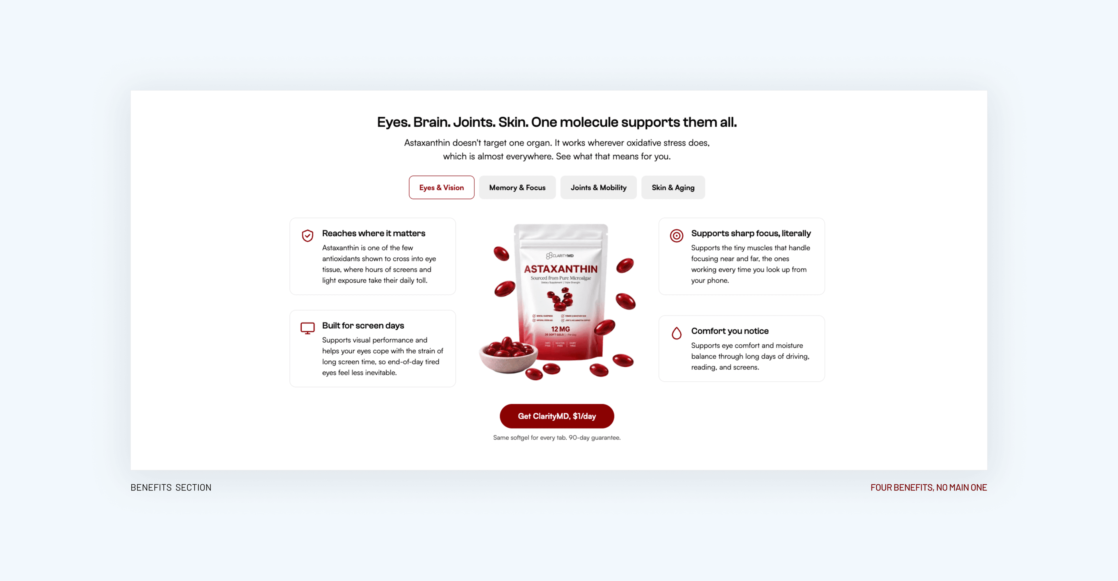
No reason stands out, so shoppers have to rank the benefits themselves.
The benefit tabs were added to the live page as a stopgap before the redesign.
Discounts do the selling
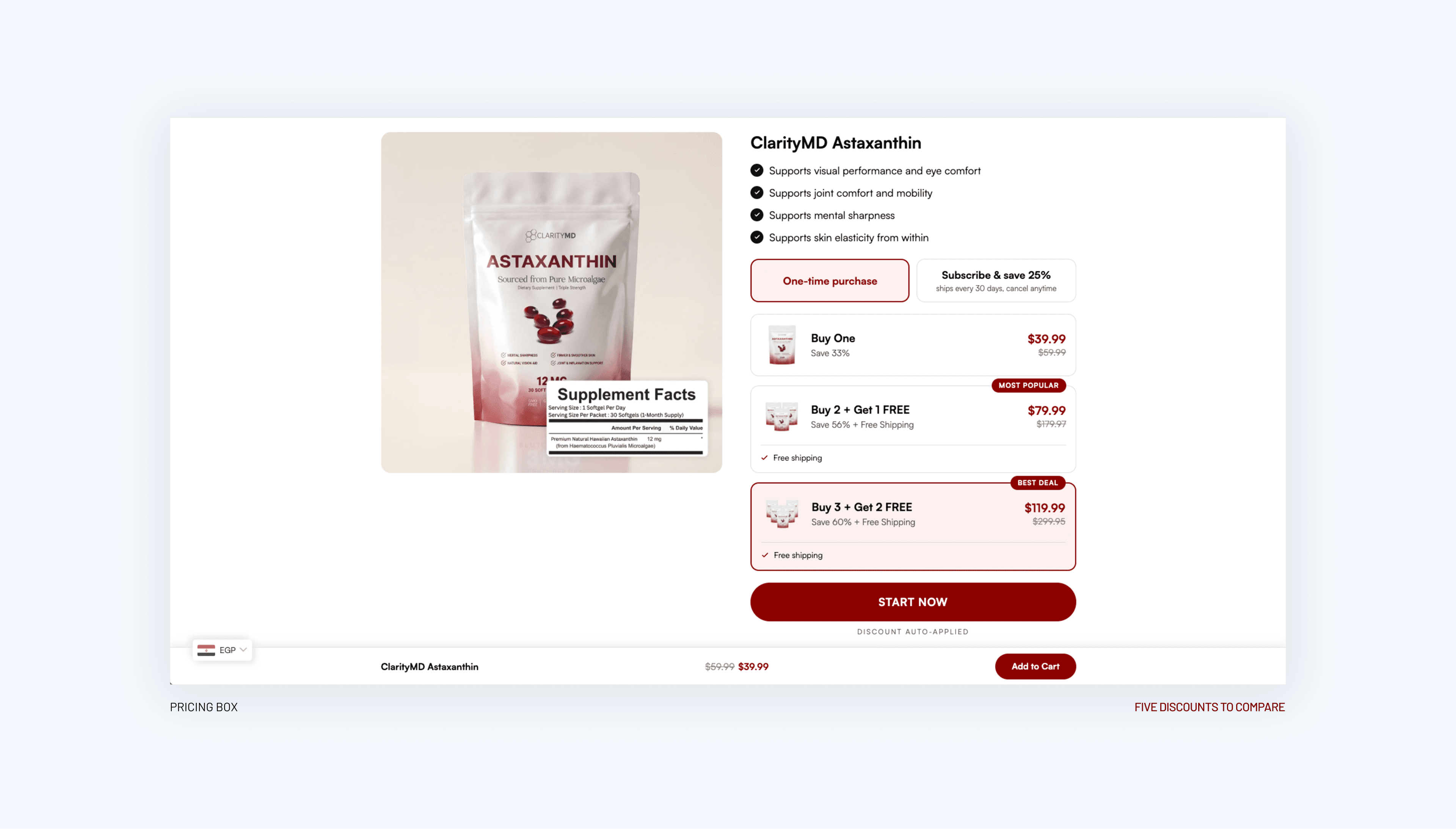
Shoppers have to do the math to compare prices. This one went into the test plan instead of being decided by opinion.
The Priorities
Sorted, not just listed
The quick fixes were contradicting product facts, placeholder copy, a broken cart message, mismatched promotions, and navigation and CTA labels. I flagged them as quick fixes the team can ship before the redesign, so the store stops losing trust while the redesign is built.
I also benchmarked five competitors selling the same product. Seven opportunities came out of it, and each one shaped the redesign.
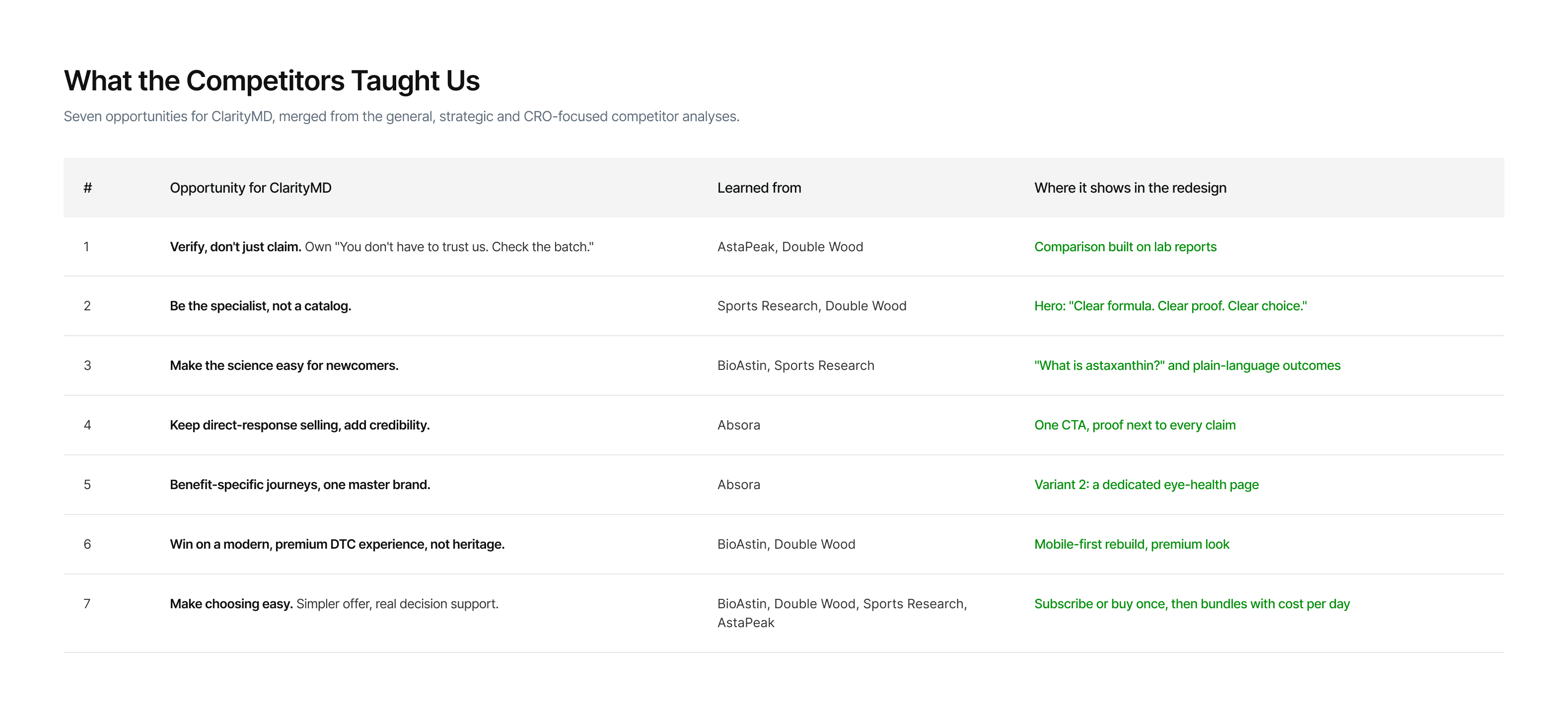
Seven opportunities from the competitor analysis.
The Redesign
Two variants that answer the four questions in order
The redesign had two jobs: fix the 9 findings that needed the page rebuilt, and deliver the premium landing page the CEO asked for. Custom photography of the sourcing and formula replaced generic product shots.
I didn't pick a favorite. I turned the audit into two variants that share the same proof and offer, and differ in how the shopper finds their reason to buy. Both are designed and approved, and ClarityMD's CRO lead is running them as an A/B test now.
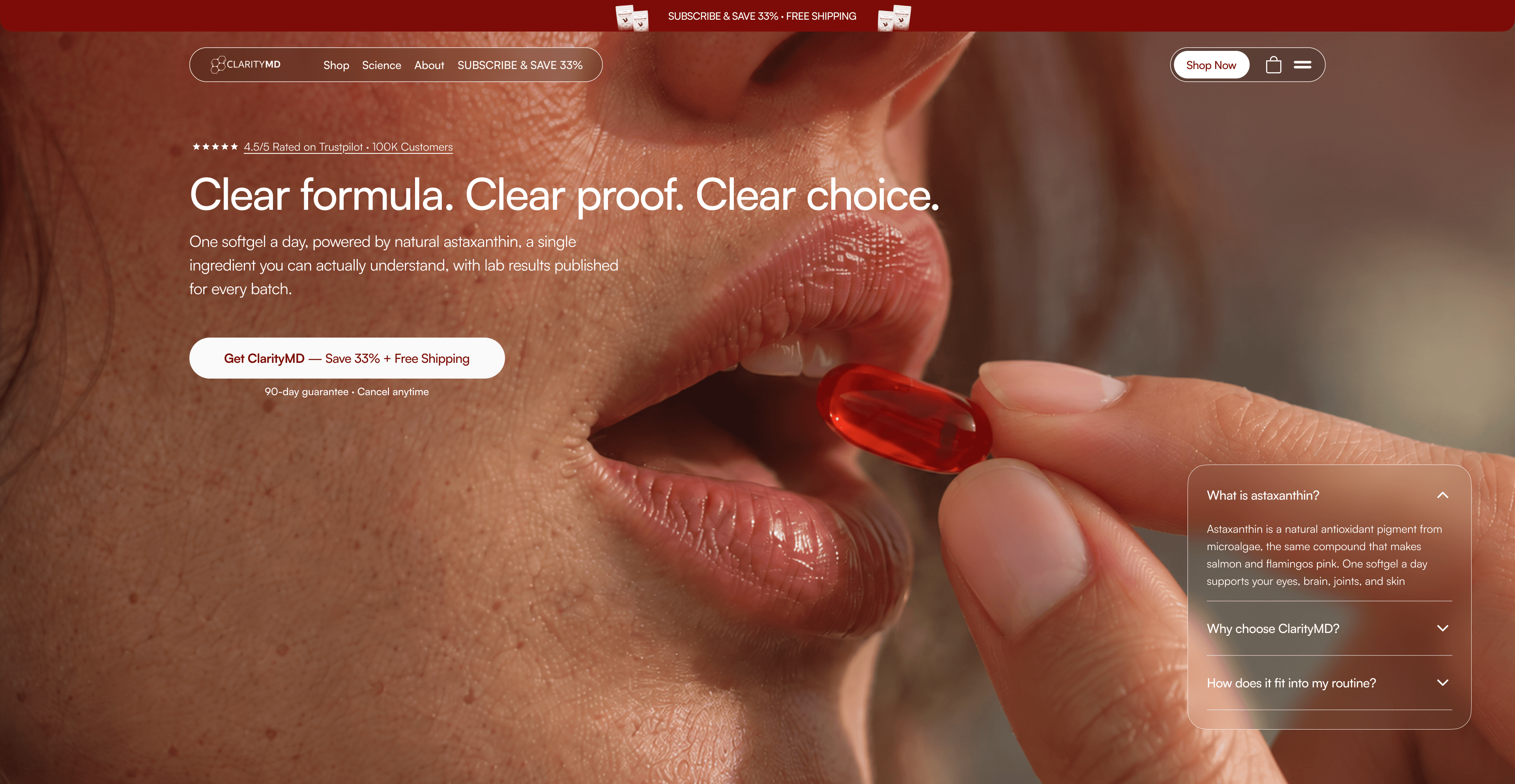 Variant 1
Variant 1: one generic page for every shopper
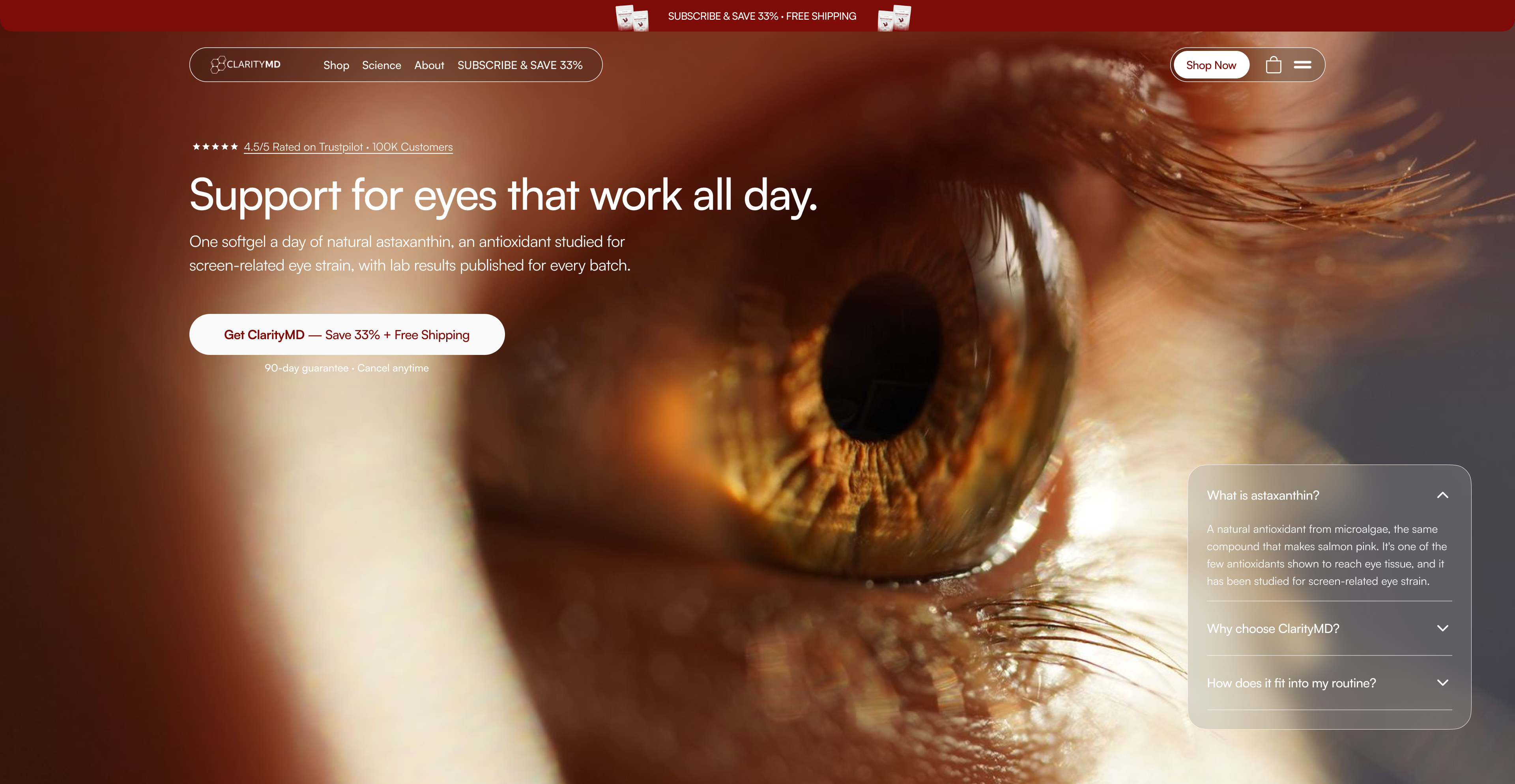 Variant 2
Variant 2: a dedicated page for eye health
Say why.
Variant 1: "Clear formula. Clear proof. Clear choice." Variant 2: "Support for eyes that work all day." Both keep one CTA.
Give the shopper a reason.
Variant 1: one page for every shopper, with need tabs. Variant 2: a dedicated page for one need, starting with eyes.
Prove it.
A comparison built on visible lab reports, not specs every competitor shares: "You don't have to trust us. Check the batch."
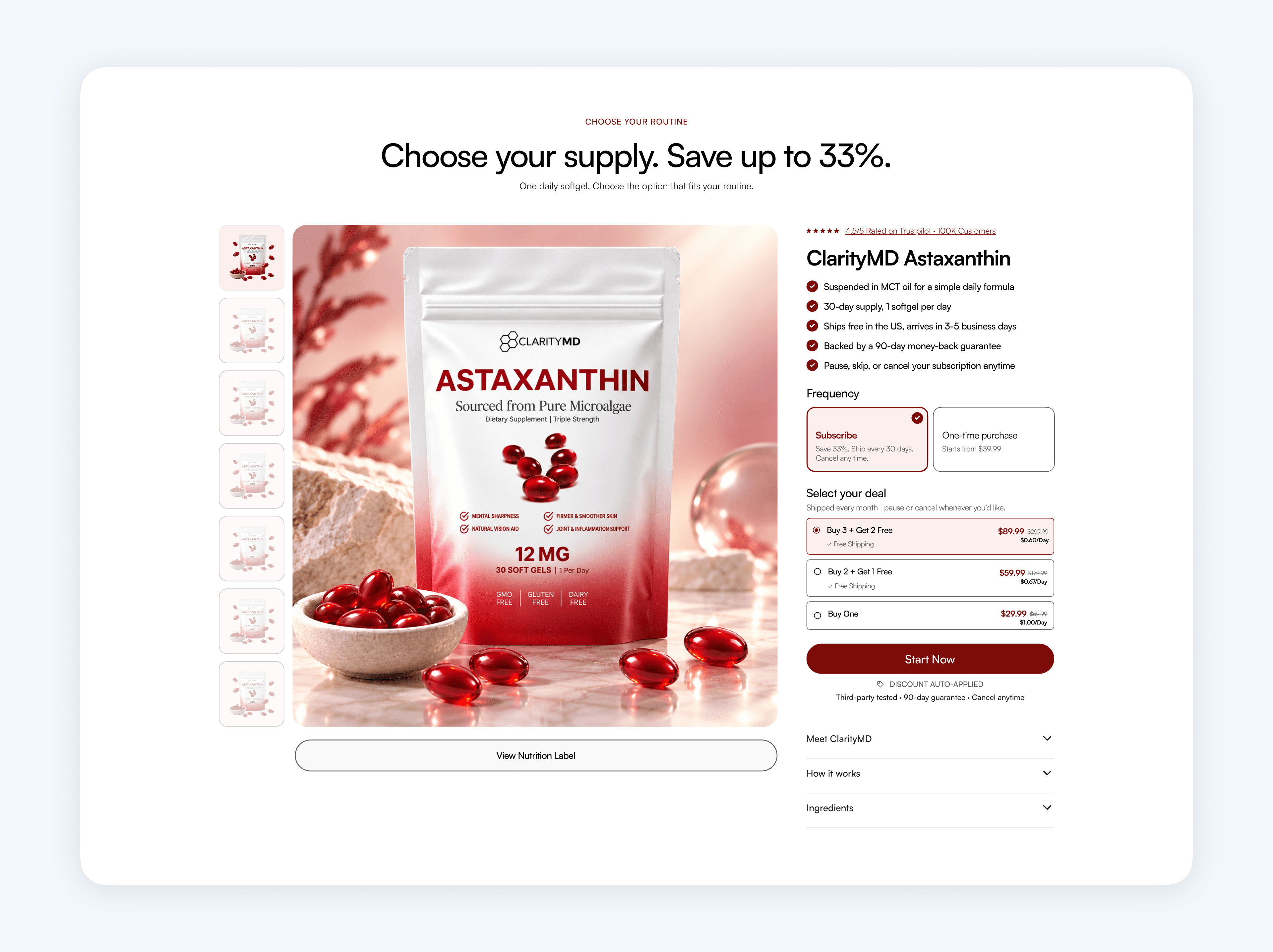
Make the choice easy.
Subscribe or buy once, then three bundles with a real cost per day ($1.00, $0.67, $0.60).
What's Next
Does that shopper stay?
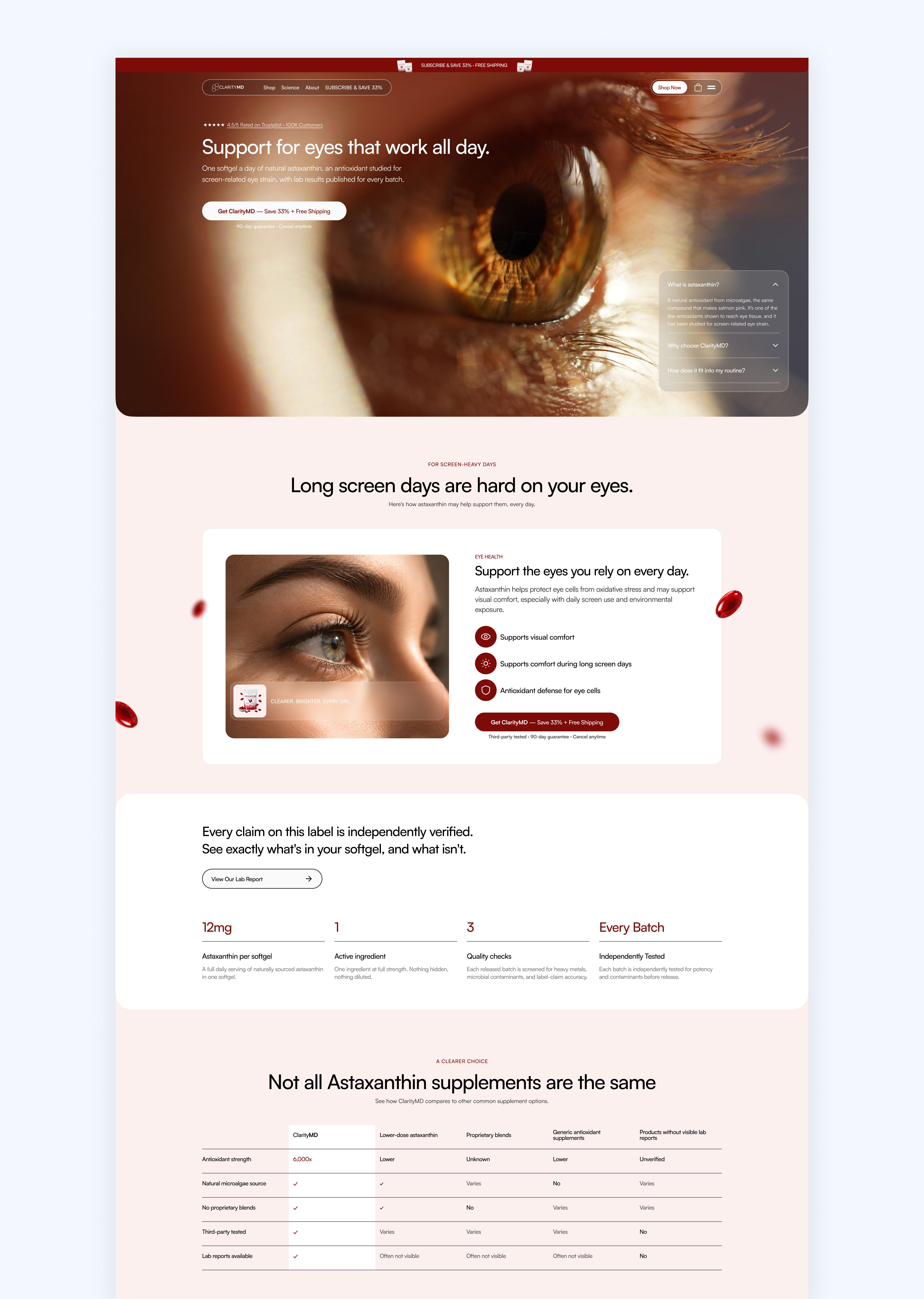
Variant 2: the eye-health landing page.
The A/B test running now answers that. Results haven't been shared yet.
How it's measured: conversion against the 1.2% baseline, plus cart, scroll and lab-report signals. The plan runs in three tests: quick fixes, Variant 1 vs 2, then discount depth.
What I'd carry forward: an audit is only useful once it's sorted into quick fixes, redesign work and tests.
Want the full story?
The detailed version: audit findings, competitor review, segments and hypotheses.